ATIL is a digital growth agency that thinks like an engineer and writes like a person.
This document defines how the brand looks, sounds, and behaves —
from a 24-pixel favicon to a 200-slide pitch deck.
Brand
ATIL
Founded
2019
Revenue driven
₹150 Cr+
Brands served
150+
The promise
We don't optimize for impressions. We optimize for revenue, margin, and the next hire you can afford.
01 Brand Story & Principles
Built by engineers. Run by marketers. Made simple for you.
Most agencies start with a sales pitch. ATIL started with a problem: managing ads at scale meant drowning in spreadsheets, deciding on stale data, and hoping for the best. So we built an agency where engineering and marketing share a desk — and where the software ships before the campaign does.
Positioning
ATIL sits between two crowded categories — generic digital agencies and pure ad-tech tools. We are the agency that ships its own software (ScaleSkus, Tri-Source Data Fusion) and uses it to make better calls on every campaign we manage. The promise is not deliverables. The promise is outcomes — measured in revenue, ROAS, and orders shipped.
Four principles
P 01
Technology-first
Build the system before the campaign. Every process automated, measured, optimized — or it's not in production.
P 02
Radical transparency
No black boxes, no hidden fees. Every data point, optimization, and rupee shown — in real time, in one report.
P 03
Outcome-obsessed
We don't optimize for impressions. We optimize for revenue, margin, and growth. Vanity doesn't pay bills.
P 04
Continuous innovation
The platforms change daily. Our tools, models, and methods change with them. Standing still is falling behind.
02 Voice & Tone
Plain English. Precise numbers. No jargon tax.
ATIL's voice is the senior engineer who became a marketer. Calm, confident, allergic to filler. Specific numbers because we have them. Plain explanations because most clients don't speak ROAS.
The mechanic
Sentence rhythm
Short. Then medium. Then a longer sentence that earns the breath by carrying actual content. Never two long sentences in a row. Never three short.
Verb-first
Lead with the verb that did the work. "Cut wasters." "Shipped daily." "Tracked every rupee." Adjectives are a tax — only spend them on numbers.
Numbers carry meaning
Every claim either has a number or admits it doesn't. "Most clients" is honest. "World-class" is not. If you can't quantify it, qualify it.
Do · Don't
Do
"₹12 Cr+ ad spend managed. Every rupee tracked. We'll show you exactly where it goes."
Specific numbers, plain verbs, ownership of the outcome.
Don't
"We leverage cutting-edge AI to deliver world-class digital marketing solutions for ambitious brands."
Generic, unverifiable, indistinguishable from every competitor.
Do
"Most clients see leads in 2–3 weeks. SEO takes 2–3 months to show real lift. Here's why."
Sets honest expectations. Earns trust by being early-clear.
Don't
"Skyrocket your business overnight with our revolutionary growth-hacking framework!"
Hype, undefined claims, exclamation. The opposite of engineering.
Do · Chart annotation
"+38% ROAS week-over-week. The jump came from pausing 54 wasters on Tuesday."
What changed, by how much, why. The chart shows; the line tells.
Don't · Chart annotation
"Strong upward trajectory across key performance indicators."
No number, no cause, nothing the reader can verify.
Words we use · Words we don't
USE
ship · build · measure · own · audit · pause · cut · track · within hours · ROAS · orders · revenue · margin · plain English · weekly report · in real time · most clients · 2–3 weeks · paused · added · saved
Headlines aren't art at ATIL — they're patterns. Five formulas cover 95% of marketing surfaces. Plug in the variables; never invent the shape.
F-1 · Outcome + proof
[verb] the [noun]. [number] [unit].
Ship the campaign. ₹150 Cr+ revenue.
F-2 · Promise + clarification
[claim] — [honest constraint].
Leads in 2–3 weeks — SEO takes longer.
F-3 · Identity statement
Built by [role]. Run by [role]. Made simple for [audience].
Built by engineers. Run by marketers. Made simple for you.
F-4 · Negative + positive
We don't optimize for [vanity]. We optimize for [revenue].
We don't optimize for impressions. We optimize for revenue.
F-5 · Number-first
[number] [unit]. [claim].
5.4× ROAS. In ninety days.
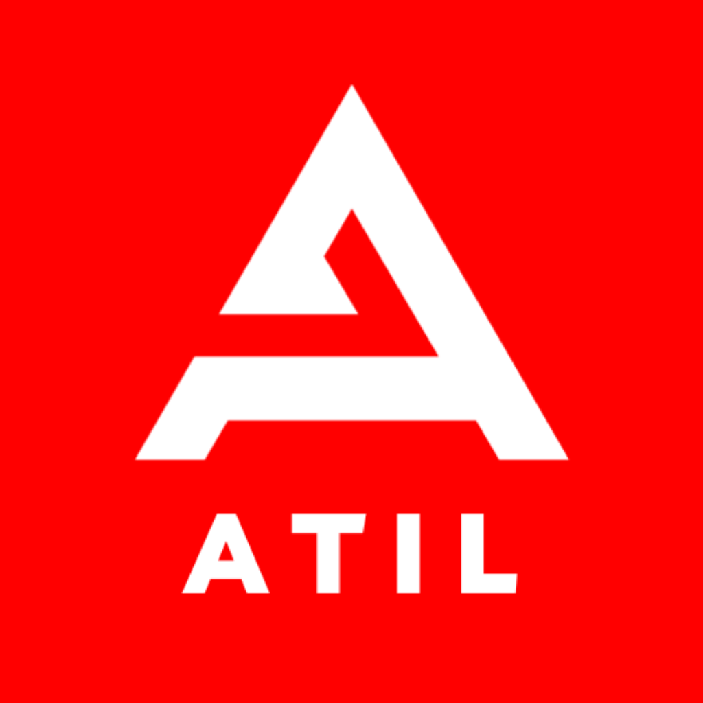
04 Logo & Wordmark
The ATIL mark.
ATIL leads with a custom "A" monogram — a heavy isosceles triangle with a stylised lightning cut at the structural midline. The cut is the brand's only ornament; it doubles as both the apex of the inner counter and a directional arrow. The wordmark ATIL sits beneath in heavy stencil caps. Architectural, structural, engineered.
A · Primary · Red on Paper200 × 200 mm exhibit
B · White on InkDefault dark surface
C · White on RedHero panels, ad creatives
The lockup family
Five approved lockups. The mark+wordmark stack is primary. Monogram-only is for square surfaces (avatars, app icons). Wordmark-only is for ultra-narrow contexts (browser tabs at 16px width, email signatures, side panels). Never invent a sixth.
L-1 · Stack — primary
ATIL
L-2 · Horizontal
L-3 · Monogram
ATILL-4 · Wordmark
L-5 · Tile · avatars only
05 Construction
Built on a 100-unit grid.
Every measurement in the mark resolves to a multiple of 10 on a 1000-unit canvas. The triangle is a 720u-wide isosceles with 680u height. The crossbar sits at 0.62 of the apex-to-base height — the golden ratio's friendlier cousin. The lightning cut is offset 22u right of centre to give the mark its directional bias.
CLEAR SPACE
1× cap-height of "ATIL" on every side. Equivalent to 120u on the 1000u canvas. Treat the mark like a held breath.
OPTICAL ALIGN
Align to the visual centre, not the bounding box. The triangle apex pulls the optical centre 8u above geometric centre — compensate when locking up with text.
THE CUT
The lightning cut is the brand's structural detail. Strokes are 32u thick, never thinner. Cut renders in Red on every approved variant — never matched to ground.
06 Scale & Clear Space
What survives at 16 pixels.
Below 24px, the lightning cut closes optically and the monogram reads as a solid triangle. From 16–23px, switch to the wordmark-only lockup or the simplified favicon SVG with the cut omitted. Below 12px, ATIL doesn't appear. Period.
128 · poster
72 · header
48 · nav
32 · button
24 · favicon
16 · simplified
Clear space exhibit
XX
07 Misuse
Eight things never to do.
If it's not on the approved lockup sheet, it's misuse. When in doubt, send the wordmark-only lockup and a link to this section.
M-01
Don't stretch
M-02
Don't rotate
M-03
Don't recolour
M-04
No drop shadow
M-05
No busy backgrounds
M-06
Don't fade or screen
M-07
Don't add a border
M-08
ATIL
Don't reset in another typeface
08 Color System
Red. Ink. Paper. Nothing else.
The system is led by ATIL Red — a high-energy red, custom-mixed 4° toward scarlet so it doesn't read as Coca-Cola or warning-state. Ink grounds it. Paper is a warm bone, not pure white — clinical white belongs to clinics. Data viz uses tints and shades of these three. We do not own a "second accent." That's a feature.
The three
R · 01SIGNATURE
ATIL Red
The brand. Logo, hero panels, primary CTAs, headline accents. One commitment per page — never two reds on a single surface.
HEX #ED1C24
RGB 237·28·36
OKLCH 60% .245 27
CMYK 0·92·85·0
PMS 485 C
RAL 3020
I · 01FOUNDATION
Ink
Body type, structural surfaces, stat cards, the foundation under everything. Never pure black — black is too cold against Paper.
HEX #0A0F1F
RGB 10·15·31
OKLCH 14% .015 264
CMYK 92·87·56·77
PMS 5395 C
RAL 5004
P · 01BREATHING
Paper
Default light surface. Warm bone, not white — softer in print, kinder on screen, reads like good paper. Body copy ground.
HEX #F5F1E8
RGB 245·241·232
OKLCH 96% .015 90
CMYK 3·3·9·0
PMS 9120 C
RAL 9001
Tints & shades — the only extensions
No second accent. When data viz needs more series, derive from Red and Ink. This is the rule that keeps every dashboard, deck, and report unmistakably ATIL.
R · 02HOVER
Red Deep
CTA hover, pressed, print-safe darker variant.
HEX #C8141A
OKLCH 50% .215 27
R · 03WHISPER
Red Tint
Quiet red surfaces — hover backgrounds, badge fills, soft alerts.
HEX #FBE6E7
I · 02ELEVATED
Ink Elevated
Cards on Ink, modal grounds, second-level depth.
HEX #131A2E
P · 02QUIET
Paper Soft
Cards / quiet panels on Paper. Never used as page ground.
HEX #ECE6D6
Greyscale ramp
9000A0F1F
8001C2540
7002D3447
5005C6478
300A8AEBC
200D6DAE2
100E7E3D5
050F5F1E8
Usage ratios
Hold to these on any single surface. Red is the spice — never the meal.
Paper layoutDEFAULT
70 Paper · 22 Ink · 8 Red
Ink layoutDARK MODE
75 Ink · 15 Paper · 10 Red
Red panelHERO ONLY
Whole panel goes Red — hero, OG card, ad creative. Once per page max.
09 Contrast & Accessibility
Every approved pair clears WCAG AA.
Body type (under 18px regular / 14px bold) needs 4.5:1. Large text (≥24px regular, ≥19px bold) needs 3:1. UI controls and meaningful graphics need 3:1. Below: every approved pairing in the system, ratios computed under WCAG 2.2.
● AA / AAA — anywhere● AA Large — display ≥24px only● Forbidden for content
Aa Body 16Ink on Paper
17.4:1 ✓ AAA
Aa Body 16Paper on Ink
17.4:1 ✓ AAA
Aa Display 24+White on Red
3.87:1 · AA-Large only
Aa Body 16White on Red Deep
5.41:1 ✓ AA
Aa Body 16Ink on Red
4.93:1 ✓ AA
Aa Body 16Red Deep on Paper
5.86:1 ✓ AA
Aa Display 24+Red on Ink
4.46:1 · AA-Large only
Aa Body 16Grey-500 on Paper
4.85:1 ✓ AA
10 Typography
Three working faces. One serif for emphasis.
Space Grotesk for display — geometric, with a slight idiosyncrasy in its A and Q that pairs naturally with our monogram. Geist for body — humanist, dense numerics, optimised for screen, and (critically) less-defaulted than Inter. JetBrains Mono for data, code, and the engineering footprint. Instrument Serif Italic appears once per surface — for emphasis only, never structure.
Space Grotesk
UseDisplay · Headlines
Weights500 / 600
Tracking−2% to −4.5%
Line height0.92 – 1.05
LicenseSIL OFL · self-host
DesignerFlorian Karsten
Outcomes, not deliverables.
Geist
UseBody · UI
Weights400 / 500 / 600
Body sizes15 / 16 / 18 px
Line height1.5 – 1.6
LicenseSIL OFL · self-host
DesignerVercel
ATIL combines engineering thinking with marketing expertise. We're not a template agency. We're not a tech-only company. We're the best of both — data-driven but human-led. Every campaign sits on a self-healing data pipeline that surfaces winners, kills wasters, and keeps the report you read on Monday honest.
JetBrains Mono
UseData · Captions · Code
Weights400 / 500
Tracking+4% to +14%
CaseOften UPPERCASE
LicenseApache 2.0 · self-host
DesignerJetBrains
campaign_idSP-AMZ-04A2spend_today₹ 4,12,330roas_7d5.42×winners_added+138wasters_paused−54last_run12s ago
Instrument Serif
UseEditorial accent
StyleItalic only · weight 400
Frequency≤ 1 per surface
LicenseSIL OFL · self-host
RuleNever replaces display
"…the agency that actually shows you what's working."
11 Type at Work
The same idea, six surfaces.
"5.4× ROAS in 90 days" — typeset for every surface where ATIL appears. The system holds because the rules are surface-aware, not size-aware.
Hero · web
5.4× ROAS in 90 days.
Display 500 · −3.5%
Deck · title
5.4× ROAS in 90 days.
Display + serif accent
OG card
5.4× ROAS 90 days.
Display on Red · short-form
Push notification
ATIL · weekly report 5.4× ROAS this week — up from 3.8×. Tap to see what changed.
Eight steps, geometric ratio of 1.25. Snap every component to one of these — no in-betweens. Ever.
Display XL128 / 122−4.5%Engineered to grow.
Display L96 / 96−4%More revenue, less guesswork.
Display M64 / 68−3.5%Built by engineers.
H148 / 52−3%Engineered to grow.
H232 / 38−2.5%What we do
H324 / 30−2%Tri-source data fusion
Body L18 / 280We don't optimize for impressions. We optimize for revenue.
Body16 / 240Default body copy across surfaces.
Caption12 / 18+8%CAMPAIGN_ID · SP-AMZ-04A2
13 Spacing & Layout
4-base spacing. 12-column grid.
Every measurement on every surface comes from this scale. Half-steps don't exist. If you find yourself wanting 22px, you want 24. If you want 7px, you want 8. Hold the line.
Spacing tokens
s-14 px
s-28 px
s-312 px
s-416 px
s-524 px
s-632 px
s-748 px
s-864 px
s-996 px
s-10128 px
s-11160 px
Radius scale
r-1 · 4
r-2 · 8
r-3 · 12
r-4 · 16
r-5 · 24
r-pill
Grid & breakpoints
Web
12-column · 1280px max
Gutters s-5 (24). Outer margins s-9 (96) at desktop, s-7 (48) at tablet, s-5 (24) at mobile. Content max 1180.
Deck · 1920×1080
12-column · 64px gutter
Margin s-9 each side. Title-grid baseline at y=120. Body type minimum 24px. Stat numerals span 6 columns.
Print · A4
8-column · 16mm gutter
Body 10pt minimum. Margins 24mm outer / 18mm inner. Charts always span at least 4 columns.
Breakpoints
XS0 – 5594 colMobile portrait
S560 – 7676 colMobile landscape, small tablet
M768 – 10238 colTablet, narrow laptop
L1024 – 127912 colDesktop default
XL1280+12 colLarge desktop · cap content at 1180
14 Imagery
Charts are the hero. Stock people are not.
ATIL is a data company. The strongest visual we own is a real chart with real numbers. Stock photography of "diverse team smiling at laptop" is forbidden. When humans appear, they are clients (testimonials, headshots) or our team — never models.
The image library — six approved tile types
T-1 · Dashboard
T-2 · Real chart
T-3 · Data nodes
5.4× ROAS · 90DT-4 · Single stat
T-5 · Weekly bars
"…the agency that actually shows you what's working."
Photography direction
Subjects
Clients (named, with permission). Team (named, with role). Workspace details — a screen, a notebook, a hand on a keyboard. Never anonymous models.
Lighting
Available light. Soft north window or single-source warm. No ring lights, no blown highlights. Shadows are okay; harsh corporate fill is not.
Palette grade
Lift blacks toward Ink (warmer, less crushed). Reds in-frame okay if naturally occurring; never tint the grade red. Highlights warm, never cool.
Composition
Off-centre subjects. Negative space carries the headline. 3:2 or 4:5 — never 16:9 unless video. Crop tight on hands and screens; crop loose on people.
Screenshots
Frame
Always inside a 12px-radius browser frame on Paper, or a flat crop on Ink. Never naked screenshots.
Annotation
One pin per screenshot. Red circle, leader line, mono caps caption. Annotation answers "what should I look at?"
Redaction
Brand names blurred at 12px Gaussian — never black bars. Numbers anonymised by ratio (5.4×) preserved over absolute (₹38,40,210) when needed.
15 Chart Anatomy
Every chart, one rule: annotate the "so what."
A chart in client comms without a one-line annotation on top is a chart that didn't ship. The annotation answers: what changed, by how much, why it matters.
+38% — paused 54 wasters W5
5.4× ROAS · today
Series order
Red — primary. Ink — comparison/baseline. Ink-50% — third. Red-tint — fourth. Never re-order to suit a slide.
Grid & axis
Grid at 6% Ink on Paper, dashed for non-baseline. Axis labels in mono caps. Y-axis always anchored at zero unless explicitly broken (with annotation).
The "so what"
One sentence pinned at the inflection point: what changed, by how much, why. Pinned in mono caps inside a hairline-red pill. Maximum two pins per chart.
16 Motion
Slow in. Fast out. Once.
Motion at ATIL is functional, never decorative. Things appear because data arrived. The signature gesture is a node lighting up — a single pulse, then stillness. Hover any card below to see motion in motion.
M-1 · Live pulse
Node pulse
2s loop, ease-out. The only allowed loop. Used on live indicators only.
M-2 · Number count-up
0.0×
Count-up
720ms ease-out. Triggered once on first scroll-into-view. Stat numerals only.
180ms ease-out. Arrow translates 4px right. Hover this card.
M-4 · Reveal sweep
Surface reveal
480ms ease-out. Red wipe, single direction. For section transitions and card reveals.
M-5 · Easing
cubic-bezier (.22, .61, .36, 1) "out-quart"
One curve
Out-quart for everything user-facing. Linear for loaders only. Ease-in for exits only.
M-6 · Durations
UI 180 ms Reveal 480 ms Hero 720 ms
Three speeds
Never custom durations. Pick one of three and move on.
17 Components
The kit that runs every surface.
Eight primitives cover 90% of every surface — site, deck, report, ad creative. Each is shown with all states, anatomy, and the spacing tokens that built it.
"47 enquiries in week one. Twelve enrolments by month one. The first agency that brought numbers, not promises."
18 Tone Matrix
One voice. Four tones.
The voice is constant — direct, specific, calm. The tone shifts with the room. A pitch deck and a "your card was declined" email come from the same brand, but the dial moves.
ContextDialIn practiceSample line
MarketingConfident · plainLead with the outcome. Specific number in line one. No throat-clearing."₹150 Cr+ revenue driven for 150+ brands. Here's how."
Product UIPrecise · quietVerb-led microcopy. Mono caps for state. No metaphors. Tell the user what changed."54 wasters paused. ₹4,12,330 saved this week."
Sales · proposalWarm · concreteFirst-person plural ("we"). Name the timeline honestly. Always end with the next single action."Leads in 2–3 weeks. SEO takes 2–3 months. Here's what we'd do in week one."
Errors · outagesCalm · accountableTake the blame. State the impact in one line. Give an ETA, not a hedge. No "unfortunately.""Our Amazon sync is paused. No data lost. Back online by 6 PM IST. — Update at 4 PM."
19 Writing Numbers
How we write money, time and metrics.
Consistency here builds trust. The same number written three different ways across a deck reads like sloppy work.
Currency
₹ symbol, no space for amounts ≤ ₹99,999 → ₹15,000 / month For larger sums use lakh / Cr → ₹12 Cr+ ad spend Always include the + when the number is a floor, not a ceiling. Indian thousand separators (12,34,567).
Metrics
ROAS as 5.4× (multiplication sign, not lowercase x). Percentages with no space → +38%. Always show the sign (+/−) when reporting change. CTR / CPA / CPC stay uppercase, no full stops.
Time
Use ranges with en-dash → 2–3 weeks. Specific days: Mon–Sun, 9 AM – 5 PM IST. Real-time labels in mono caps → UPDATED 12s AGO.
Numbers in copy
Spell out one through nine ("three months"). Numerals from 10 onwards ("10 lakh orders"). Mixed scales OK in proof rows: 150+ brands · 12 lakh orders · ₹150 Cr+ revenue.
20 Co-branding
When ATIL appears next to another mark.
Most co-brand work is case studies, partnership announcements, and platform-certified badges (Meta, Google, Amazon Ads). The rule: ATIL never competes with the partner's mark — but never disappears next to it either.
Approved lockups
CLIENT × ATIL
Brand X
Vertical hairline divider, 1px Ink at 18%. Heights matched optically (mark cap-height = partner cap-height), not bounding box.
PARTNER BADGE
Certified partnerAmazon Ads
"Certified partner" is mono caps, never display. Partner mark uses its own brand colour as approved by their guidelines.
Order
Client first when ATIL is the agency. ATIL first when ATIL is the host (events, partnership announcements). Alphabetical when peer.
Clear space
Each mark keeps its own clear space (1× cap-height). The hairline sits in the middle of the combined gutter, never inside either mark's clear zone.
Never
Don't merge marks into a single lockup. Don't recolour the partner's mark to match ATIL. Don't put both on the same coloured tile — one always wins, both lose.
21 Social & Favicon
Avatars, OG cards, app icons.
At avatar scale the wordmark stops working. The square-tile lockup — the "A" on Red — takes over. This is the only place the tile is allowed. Everywhere else, free the mark.
Avatar set
App icon · 1024px iOS rounded mask
Social avatar · 400px LI / X / IG / YT
Favicon · light 16 / 32 / 48 px
Favicon · dark media-query swap
OG / share card · 1200 × 630
ATIL · 04 / 26
Case study
From 3.8× to 5.4× ROAS in ninety days.
atil.ltd / case / brand-xREAD →
Wordmark top-left, headline left-aligned, never centred. Clear space (1× cap-height) preserved on all four sides. Italic serif accent permitted on one phrase. Red node visible only as a soft radial behind the headline — never as a stamp.
Specs
App / PWA icon
1024 × 1024 · iOS rounded mask "A" at 60% of canvas Red ground · solid #ED1C24
Favicon set
16 · 32 · 48 · 180 px SVG primary · ICO fallback Dark/light via media query
Social avatars
400 × 400 minimum Crop-safe to 60% radius Same artwork across platforms
22 Legal & Trademark
The small print that keeps the brand the brand.
Naming
"ATIL" is always set in capitals — never "Atil" or "atil." in editorial copy. The legal entity is "Artallur Technologies Pvt. Ltd." Use it once at the bottom of formal documents (footers, contracts, invoices) and the short-form ATIL everywhere else.
Trademark notice
First mention in long-form copy carries the ™ → ATIL™. Subsequent mentions drop it. The wordmark and monogram are claimed as trademarks of Artallur Technologies Pvt. Ltd.
Third-party marks
Always credit. "Amazon Ads, Meta, Google Ads are trademarks of their respective owners." Goes in the footer of any page, deck, or PDF that uses partner marks. Never imply endorsement we don't have.
Photography & data
Client screenshots used in case studies require written sign-off. Anonymise revenue figures unless explicitly approved. Internal team photography is owned by ATIL; external photographers retain credit per their contract.
Open-source fonts
Space Grotesk, Geist, JetBrains Mono and Instrument Serif are all SIL OFL or Apache-licensed. Self-host. No CDN dependencies in production. Attribution lives in /about/credits.
Reporting misuse
Saw the wordmark stretched on a partner site? A competitor using a near-identical "A on red" tile? Email legal@atil.ltd. Most issues resolve with a polite note and a link.
Status semanticsNever lean on Red alone to mean "alert."
Red is a brand colour, not a status colour. Status states (error, warning, success, live) must be carried by an icon and a label as well as colour — accessibility-mandated, brand-protective.
23 Decision Log
Why we chose what we chose.
For the next designer who joins and asks "why this colour, why this typeface, why no second accent." Decisions are documented with their alternatives so they can be revisited deliberately, not by accident.
Why ATIL Red shifted toward scarlet
D-01 · 2026-04
Stock #ED1C24 reads as Coca-Cola / Target / generic warning red. We pulled hue 4° toward scarlet and eased saturation 2% so the red is unmistakably ours, not a stock RGB.
Considered: Pantone 485 C (close), Vermilion (#E34234, too orange), Crimson (#DC143C, too pink), Stock #FF0000 (rejected — never).
Custom mix — OKLCH(60%, 0.245, 27)
Why no second accent colour
D-02 · 2026-04
Earlier draft included Ember (#FF7A1F) and Sky (#7AB8FF) as data-viz accents. Both fought Red on dashboards and made Sky read as generic SaaS. Cutting both forces commitment: one signature colour, derived series only.
Inter is the 2024–25 default for "designy SaaS" — using it would flatten the brand into the pack. Geist is in the same family of competence (humanist, dense numerics, screen-optimised) but less-saturated in market. Tabular figures make every dashboard feel like a product.
Considered: Inter (too defaulted), ABC Diatype (paid, custom), GT America (paid), IBM Plex (good but corporate-IBM-coded).
Geist 400/500/600 — open source, self-hosted.
Why Space Grotesk for display
D-04 · 2026-04
Geometric, with a slight idiosyncrasy in its A and Q that pairs naturally with our angular monogram. Less defaulted than Söhne, free where Söhne is paid. Holds at 12px caption AND 144px display, which is rare.
Considered: Söhne (paid, defaulted), Neue Haas Grotesk (too neutral), GT Walsheim (too round), Modified Space Grotesk with custom A (Phase 2).
Space Grotesk 500/600 — Phase 2 may custom-cut the A to match monogram.
Why Paper #F5F1E8 instead of pure white
D-05 · 2026-04
Pure white reads clinical and amplifies blue light against Ink. The warm bone tone reduces clinical-tech feel and gives prints a paper-like quality that off-white doesn't.
Considered: Pure white #FFF (cold), Off-white #FAFAF7 (better but still flat), Bone #F5F1E8 (chosen), Cream #F2EDDC (too yellow).
#F5F1E8 — OKLCH(96%, 0.015, 90).
Why the lightning cut, not a flat triangle
D-06 · 2026-04
A flat triangle reads as generic startup / pyramid scheme. The cut adds directional bias (up-and-right), an engineering signature (it's the only ornament), and degrades gracefully — at favicon size, the cut closes optically and the mark reads as solid, which is fine.
Considered: Solid triangle (bland), Negative-space A (too Helvetica), Hand-drawn A (off-brand), Lightning cut (chosen).
Lightning cut · 32u stroke · 22u offset right of centre.
24 Changelog
Versions of this document.
Brand documents change. This one logs every change so you know what's current and why.
v2.0Apr 2026
Full rebuild. Custom-mixed Red. Cut Ember & Sky accents. Replaced PNG mark with construction-grid SVG. Added: Headline Formulas (§03), Construction (§05), Type at Work (§11), Spacing & Layout (§13), Chart Anatomy (§15), Decision Log (§23), Changelog (§24). Component states + anatomy. Working motion lab. Self-violations fixed (eyebrow contrast, Ember-as-status, OG clear-space).
v1.1Apr 2026
Added Co-branding (§15), Social & Favicon (§16), Tone Matrix (§14). Refined contrast pairs. Pulled Red away from web-safe #FF0000.
Ten upgrades for atil.ltd, roughly in priority order.
The current atil.ltd site is functional and clear. These are the deltas that would push it from "generic-good" toward a brand that's recognisable in a screenshot.
R-01
Today
Red is the brand, but barely used outside the logo
Site goes navy/blue once you scroll past the header. The most ownable colour the brand has is left on the bench.
Recommend
Lead with Red on every page
One full-bleed Red panel per page — hero, pricing CTA, or block-quote. The brand becomes recognisable in a 100×100 thumbnail.
R-02
Today
Mark locked to a red square tile
The current logo is the "A" on a solid red field. It works as an avatar, but reads as boxed-in everywhere else — letterheads, ad creatives, deck covers.
Recommend
Free the mark from the tile
Use the transparent-background "A" (red on Paper, white on Ink) as the working mark. Reserve the square-tile lockup for social avatars and favicon only.
R-03
Today
Three competing taglines
"AI-powered" vs "engineered" vs "made simple" — all three appear on the homepage. Each is fine; together they dilute.
Recommend
Pick one tagline, retire the others
"Engineered to grow." Use it everywhere — social bios, email signatures, deck covers, the front door of the site. Once.
R-04
Today
Type system relies on system fonts
Renders inconsistently across devices and feels temporary.
Recommend
Lock in Space Grotesk + Geist + JetBrains Mono
All three open-source. Self-host. Mono is the high-leverage detail — it makes every dashboard screenshot feel like a product.
R-05
Today
Stat numbers sit in plain paragraphs
"₹150 Cr+", "150+", "12L+" are the most powerful proof we have, but they're treated as body text.
Recommend
Build the stat-card primitive (C-02)
Ink card, Red numeral set in Display L, mono caption. Use as the second viewport on every service page. Numbers do the work the tagline can't.
R-06
Today
Generic agency stock photography
"Smiling team at laptop" doesn't differentiate ATIL from a logo factory. It also undersells the engineering story.
Recommend
Replace stock with ScaleSkus screen-grabs
Real dashboards, anonymised brands, annotated. Every "people" image becomes a real client headshot or a real team photo. Honesty is the differentiator.
R-07
Today
Testimonials are name + initial avatar
They read as filler, not proof.
Recommend
Pair every quote with a hard number
"Genuine enquiries" → "47 enquiries in week one, 12 enrolments in month one." Anonymise the brand if needed. The numbers carry the credibility.
R-08
Today
"Made simple" is told, not shown
The phrase appears in copy, but the site itself isn't dramatically simpler than competitors'.
Recommend
Ship a one-page weekly report template
One sheet, four numbers, one paragraph, no jargon. Public artefact (downloadable PDF). It is the proof of the promise.
R-09
Today
No motion language
Hover states are default browser. Page transitions are blank.
Recommend
Adopt the motion lab (§16)
Stat numerals count up on first scroll-into-view. Live badge has a pulse. Buttons nudge 4px right. Tiny, consistent, owned.
R-10
Today
Sub-brand sprawl risk
ATIL, Artallur Technologies, ScaleSkus, "AI-powered SEO," "GEO & AEO" — each gets its own page-level treatment.
Recommend
One masterbrand, one sub-product
Treat ScaleSkus as the only first-party product. Everything else — SEO, ads, websites — sits under ATIL services, not as quasi-products.
26 Assets & Downloads
Everything in one folder.
Logo files, colour tokens, type files, templates, the works. Send links — never attach the raw PNG. Brand artefacts are versioned alongside this document.
Avatars, OG cards, app icons.
At avatar scale the wordmark stops working. The square-tile lockup — the "A" on Red — takes over. This is the only place the tile is allowed. Everywhere else, free the mark.
Avatar set
iOS rounded mask
LI / X / IG / YT
16 / 32 / 48 px
media-query swap
OG / share card · 1200 × 630
in ninety days.
Wordmark top-left, headline left-aligned, never centred. Clear space (1× cap-height) preserved on all four sides. Italic serif accent permitted on one phrase. Red node visible only as a soft radial behind the headline — never as a stamp.
Specs
App / PWA icon
1024 × 1024 · iOS rounded mask
"A" at 60% of canvas
Red ground · solid #ED1C24
Favicon set
16 · 32 · 48 · 180 px
SVG primary · ICO fallback
Dark/light via media query
Social avatars
400 × 400 minimum
Crop-safe to 60% radius
Same artwork across platforms